Saturday 28 June 2014

EXP3 Final Submission

Mashup


References

Biesek Design, “What is Wayfinding?,” www.biesek.com/whatis.html (accessed May 15, 2014)

Wikipedia, “Functionalism (Architecture),” http://en.wikipedia.org/wiki/Functionalism_architecture (accessed May 15, 2014)

Harold-Sprague Solie, “Theories on Architecture”, designHUSTLE, posted April 10, 2012, http://archinect.com/designHUSTLE/theories-on-architecture (accessed May 15, 2014)

Perspectives

The "Firm Locale" perspective was chosen as the design of my architectural folly.


Textures

The textures were used as the flooring of both the bridge and the school, as well as the feature wall for the stairs between floors. The specific textures used were Scalar #3, Responsive #5 and Lattice #6.


Sketchup Model


Draft Lumion Environments


This desert landscape is based on Death Valley, Nevada, US. Full of large rolling dunes and very dry arid rock formations.


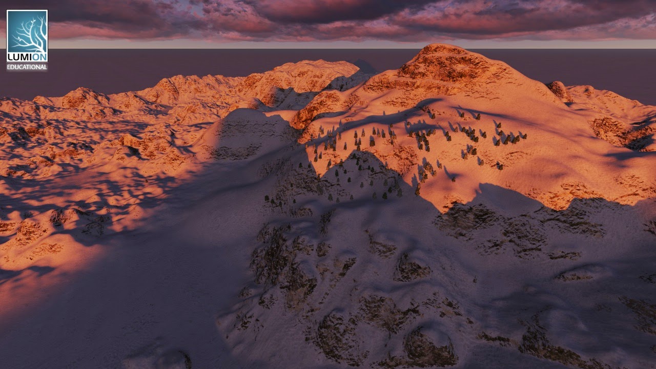
This snow environment is based on Silverstar Ski Resort near Vancouver, Canada. A large densely snow covered mountain, it is the favourite ski spot for my family when visiting Canadian relatives.

Fully Developed Lumion Environment


Moving Elements:
1. Elevator

2. Moving Light Fixtures

 
Embodies the concept of place, where the direction and landmarks of the building are easy to spot and navigate towards. The elongated plan enables an easy to follow "wayfaring" approach to the structure, providing a functionality to the school as a whole.
The bridge exhibits a firmness implicit in the overall design style, giving a sense of solidarity to both learning and the buildings utility. The straight east to west orientation of the building allows pedestrians to move through the entirety of the space and make easy decisions on when to turn off and experience a separate area.
Each floor is designed with a different function, the bottom floor contains the workshop and studio spaces (separating noisy activities from quieter areas), the middle floor holds the gallery where works can be displayed in the most public area, whilst the top floor exhibits the library, lecture theatre and research areas where serenity is more required. In this way the building exudes functionality.
The balconies and elevator extend the public domain on every floor, making it simple to navigate from area to area as each floor is within view. Through this method a convenient layout is achieved where pedestrians acquire cues to "well planned, seamlessly connected and aesthetically pleasing" ideas of architecture.
The Folly, whilst separate from the main building, is almost always within view. The peaceful area allows an escape from the public domain of the school with areas to sit, read and relax. As such the Folly itself enriches the essential construction of the larger building.
Link to Lumion Environment


Feedback Forms


Progression of Plan

The plan grew from the original 2 storey concept to incorporate the much needed space, these images show how the idea developed from origin until final product.


Thursday 15 May 2014

EXP3 Week One - 18 Perspectives & Article MashUp

The following shapes are derived from the task of constructing an Architectural Folly using 3 cross shaped prisms. Most of the images are completed as 1 points, however some have been done as 2 points to further explore their shape.


Next is the MashUp of articles. For this part of the task I have used a blog entry, a studio's explanation and a wikipedia article regarding Architectural concepts.


References for Mashup: 
Biesek Design, “What is Wayfinding?,” www.biesek.com/whatis.html (accessed May 15, 2014)
Wikipedia, “Functionalism (Architecture),” http://en.wikipedia.org/wiki/Functionalism_architecture (accessed May 15, 2014)
Harold-Sprague Solie, “Theories on Architecture”, designHUSTLE, posted April 10, 2012, http://archinect.com/designHUSTLE/theories-on-architecture (accessed May 15, 2014)

Monday 5 May 2014

ARCH1101 EXP2 SUBMISSION

Figure_01

The Two Concepts

The two client Architects for my experiment were Mies Van der Rohe and Nathalie De Vries of MVRDV Architects. 

Nathalie De Vries - Axo_5 Concept: A counterpoint against massive uniformity and monumentalising public life and space.

Mies Van der Rohe - Axo_6 Concept: Keep the building as a backdrop to the public space and highlight social culture.


Electroliquid Aggregation Concept: To create a monumental backdrop which accentuates the grandeur of social interaction and the public space.

18 Axonometric Drawings

Figure_02: Original 12 Axonometrics

Figure_03: Combined Axonometrics

36 Custom Textures
The 36 textures are shown as light, medium and dark, with each design having two of each category. (Besides the first two designs which only have one of each category) The textures used in my model are the 3rd of texture_2, the 4th of texture_4, and the 2nd of texture_5.
Figure_04: 36 Custom Textures

The Landform
These images are included so as to provide a clear view of the landscape and the way that the monuments span the cliffs above the large lake.

Figure_05

Figure_06

Figure_07


The Image Captures and Architecture

Further images of the project can be observed in the prior blog post "Lumion Image Gallery".

Model and Lumion Download Links:
Lumion Dropbox Link: https://www.dropbox.com/sh/rg1ccqt3gwxp93c/oTw8MAEwUr

Electroliquid Aggregation of Concepts: To create a monumental backdrop which accentuates the grandeur of social interaction and the public space.

Figure_08: This snapshot presents the bridges that connect both the monuments, as well as the central meeting space. Thus, exhibiting how the focus of the structure is drawn to the areas designed for social activities through structure and the terrain.
Figure_09
Figure_10: This image displays the monuments themselves acting as a public space, flowing into the central hub. As such, they perform their own function of social interaction whilst also maintaining a position which highlights the magnitude of the student meeting place.
Figure_11: The textures included all aim to accentuate the space between the two monuments, without reducing the significance of the monuments themselves. In this way, the structures maintain a prevalent influence which impacts the observer when viewed.
Figure_12


Sunday 4 May 2014

Lumion Image Gallery

This post is a gallery of images depicting my Exp 2 model within it's Lumion Environment, I have done this so that a greater understanding of my submission can be gained, as well as to showcase my work.